

Tactics For Reusable UI Components
Do you feel that the components are never plug-and-play?


Introduction
Do you ever feel that when you develop a new page or feature in the frontend, you create or change the components too much? That the components are never plug-and-play?
The problem might arise for two reasons. The design is different, and you need new components, or the components are not reusable enough. This article is about the second one.
A set of rules to create reusable components.
Many thanks to Elina Nenonen for reviewing this article from the beginning, adding new rules, and improving the ones I initially set.
External Geometry and Positioning
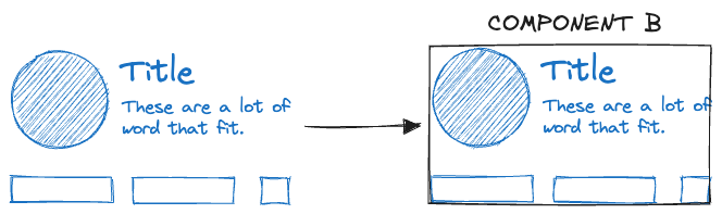
The parent should set the space between components.
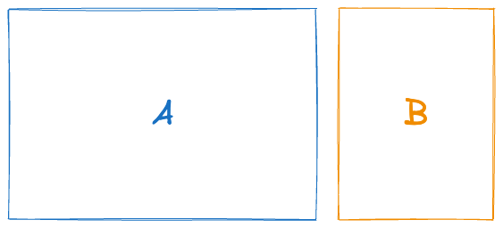
Let’s say we have a layout with components A and B and some spacing between them:
There are multiple ways of adding space between these two components. For example, we can set a “margin-right” on component A:
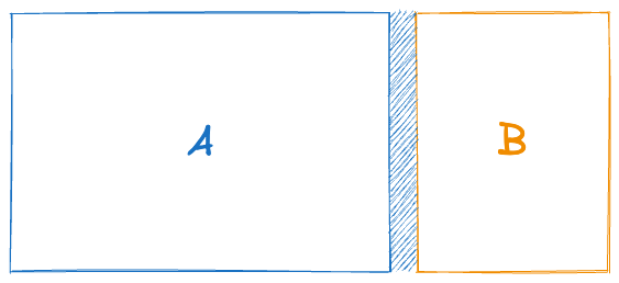
Yet, what if we want to use component A in another setting that doesn’t require this “margin-right”? We could add a prop to configure the margin, but then the component increases in complexity.
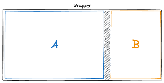
Instead, the parent should use wrappers to set the spacing among components, such as Flexbox with gap.
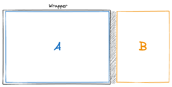
Or a wrapper around component A that sets margin-right:
“Styles that are responsible for the external geometry and positioning are set via the parent block.” BEM Methodology
Rules for External Geometry and Positioning.
Use `border-box`
Set the components’ “box-sizing” rule to “border-box”.
The MDN has the best example of how `content-box` (the default “box-sizing” value) messes up reusable components. With “border-box,” the border and padding are part of the 100% width. Otherwise, they add to the 100%, making them overflow.
Set “border-box” globally for ALL the HTML elements.
No Spacing Outside
The components finish where the content finishes.
Do Not Set Height
Let the content define the height of the component. There are exceptions like icons or avatars. Most exceptions are basic UI elements that need a specific size.
Use 100% Width
Let the component take all the horizontal space; the parent should limit that if required. There are exceptions in the UI elements like buttons, icons, etc.
Composition Over Inheritance
Theme With CSS Variables
We should have a set of CSS variables that form the application's theme, like font sizes, spacing, colors, etc. Then, we use those CSS variables to set styles in the components instead of relying on the cascading style.
For example, each component sets its font size with a CSS variable instead of depending on the parent’s size.
Reset HTML Elements
Consider HTML elements as UI elements of the application and apply the same rules. They should not set outer spacing and rely on CSS variables to set the styles.
For example, the <p> tag element can be viewed as a component to render text. If we apply the rules so far, we remove all margins and paddings and set the styles with CSS variables.
p {
  color: var(--contrast);
  font-size: var(--font-size-standard);
  margin: 0;
  padding: 0;
}
Open for Extension But Closed for Changes
Don’t Let the Parent Override Style Rules
Do Not Use Important or Global Rules
There are different ways to override the styles inside a component from the parent. One way is to use !important. Another is using “:global” from CSS modules.
Imagine the parent wants to change the color of a text. Therefore, it sets the color with !important in the <p> tag. We change the component's implementation one day and remove the <p> tag. The text color won’t be the expected one. That’s because the parent relied on the implementation details of the component.
If different text colors or properties are needed, the components should expose props to change accordingly. We can even expose a “style” prop that accepts any valid CSS rule
Do Not Override CSS Variables
Another way to change a rule from a parent is by using CSS variables.
Let’s say we have a component whose spacing between the title and subtitle is set inside the component with a variable or a default value.
.title {
  margin-bottom: var(--title-margin-bottom, 8px);
}
Then, in the parent where I use the component, I set the value of this variable:
// Inside parent
--title-margin-bottom: 12px;
That means we need to know about the implementation details of the components.
Components should expose all the possible configurations through props (their public API).
No Business Logic
Push State Out
Components are more reusable if they don’t have state.
For example, we build a dropdown that opens when the user clicks the title. Yet, in the next iteration, we want to use this same dropdown, but it has to open when the user clicks a button outside the component that opens all similar dropdowns. Our dropdown that managed state is not reusable anymore and needs to be extended.
Stateless components are more verbose because we need to add state management. We solve this by creating a second component that wraps the first one and adds the state management functionality.
Props Should Be Primitives
To ensure the components are reusable, make them agnostic of the business domain. Therefore, the props should not be related to the domain.
For example, a card component that expects a “User” can’t be used to show a “Book”.
<Card user={myUser} />Instead, build a component that expects primitives such as “title,” “image,” and “description.” We then use another component that expects the “User” as a prop and decomposes the “User” object into the primitives to use the “Card.”
<UserCard user={myUser} />

// and

<Card title={...} subtitle={...} image={...} />
Be Consistent
Something that helps to remember how to use a component is when all components behave similarly.
For example, always use “large,” “medium,” and “small” for sizes instead of expecting “l,” “m,” and “s” in one or pixel values in another one.
Manage Content Edge Cases
Think of what content the component is ready for. Can it have long texts? Does it need an image? Can we use default icons?
Overflowing content is another common problem in components. To make them reusable, we should consider how the element behaves in such a case ahead of time.
When components manage all the edge cases, they are more reusable.
Summary
These rules will help you create plug-and-play components and speed up your development:
Leave external geometry and positioning to the parent.
Use CSS Variables instead of relying on cascading styles.
Reset the HTML elements’ style to follow the same rules as the other components.
Don’t let the parent override style rules.
Expose configuration in the component interface.
Push state out.
Use primitives in props.
Use props values consistently.
Manage content edge cases.
There are always exceptions, but this should help you build more reusable components. Don’t hesitate to reach out to me with more rules or challenge the ones on the list.
Again, thanks to Elina for helping with the article!
Let’s start a discussion in the comments
Do you like the rules?
Is there a specific rule I mentioned you think it’s wrong?
Do you have other rules that I didn’t list?
Who should own and set these rules? Design or development?
Who owns the UI components at your organization?
Looking forward to discuss with you this topic!
Totally agree with these!