False Friends: font-size and line-height
Padding and the margins set the space between content areas. Yet, that’s not the only space we see on the page.

Problem: Extra White Space
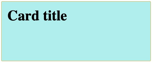
We have a Card component with some padding.
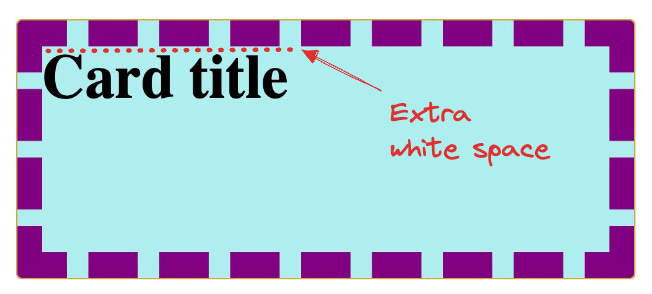
The top of the title is further away from the border than the padding:
Have you ever had this problem with white space between texts and other elements?
Personally, this kind of white space was particularly annoying until I learned that font-size and line-height are false friends. They are not what they claim to be.
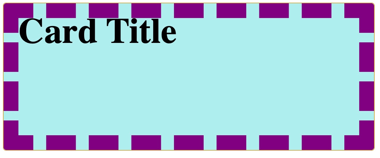
Note that line-height: 1; is not the solution. It reduces the spacing, but it doesn’t bring the title next to the padding.
I would expect that when I set line-height: 1 the border touches the top of the character. More like the following:
Font-size Is Not the Size of the Font
Let’s change the text to have only lowercase letters.
The space between the top of the title and the padding increased. The size of the title is the same, no matter the text of the title.
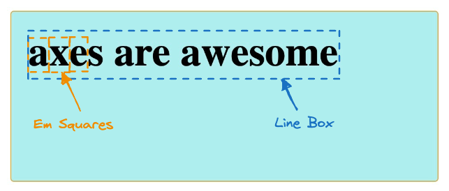
That’s because the font-size is not the size of the characters but the size of the Em Square where the characters fit.
Think of the Em Square as a box for each glyph. The font size and family determine the Em Square's height, not the character. Therefore, small characters leave more vertical space.
Line-height Is Not the Height of the Line
When I have a text, I consider the line to be the space between the top and the bottom of the line.
Therefore, the height of my line goes from top to bottom.
Yet, that is not what line-height controls.
Line Box
The text inside an element fits inside one or more Line Box. The Line Box height is calculated from the font-size and the line-height. But the text is centered within the Line Box.
The line-height sets the height of this Line Box:
Conclusion
When checking spacing between elements, remember that the padding and the margins set the space between content areas. Yet, that’s not the only space we see on the page.
Line boxes and the Em Square also add white space to our web application:
Don’t be fooled by the names “line-height” and “font-size” anymore.
Bibliography
Some further reading in case you are interested in more details:
https://iamvdo.me/en/blog/css-font-metrics-line-height-and-vertical-align
https://www.aleksandrhovhannisyan.com/blog/dont-use-a-fixed-line-height/
https://fonts.google.com/knowledge/glossary/line_height_leading
Thanks to Bernat, Elina, and Sebastià for reviewing this article 🙏


Appreciated the read on this often very complicated topic. Great to be able to refer to.
Do you have a recommended pattern for "solving" that original case you brought up?